Badge of honour
When Nigel chose metallic silver as the theme colour for the project, the name Quicksilver spontaneously followed. The bold aesthetic honours two British speed-record aces of yesteryear, John Cobb and George Eyston, whose most famous machines were silver.
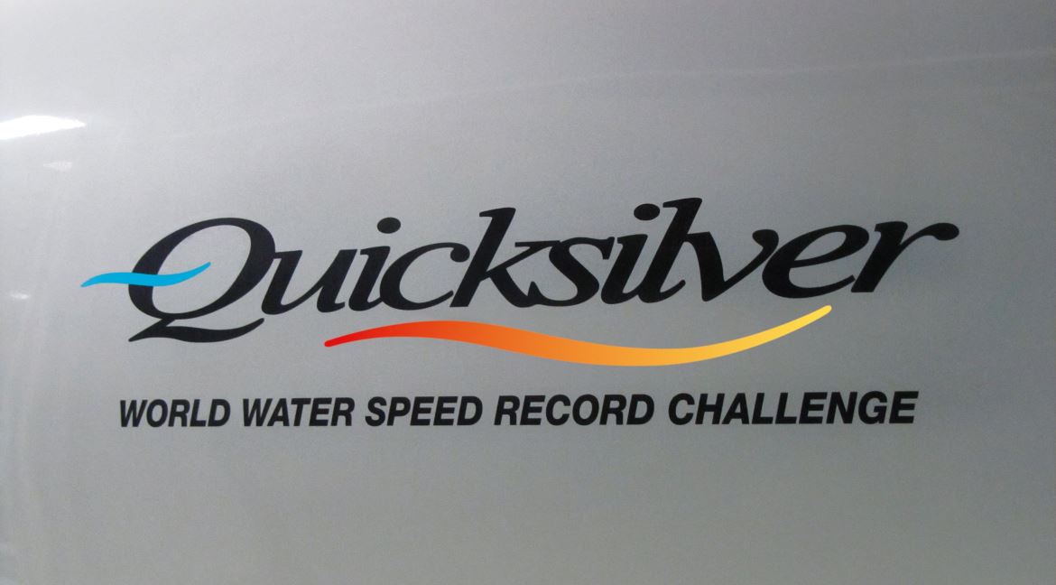
Strange what magic there is in symbols. And symbolism's alive in the Quicksilver logo, which Nigel created with his friends, Nottingham graphic-designer brothers Terry and Brian Godfrey. Flowing lines evoke the nature and dynamism of water and air, while vivid colours in the wave underscoring our name signify combustion. The distinctive blue wave set within the letter Q honours two more British speed-record heroes, Sir Malcolm and Donald Campbell – who in their respective eras, at the helms of their iconic Bluebirds, stamped their dominance on the international scene.
The Quicksilver logo is pictured here displayed 'large, loud and proud' on the boat's port sponson.

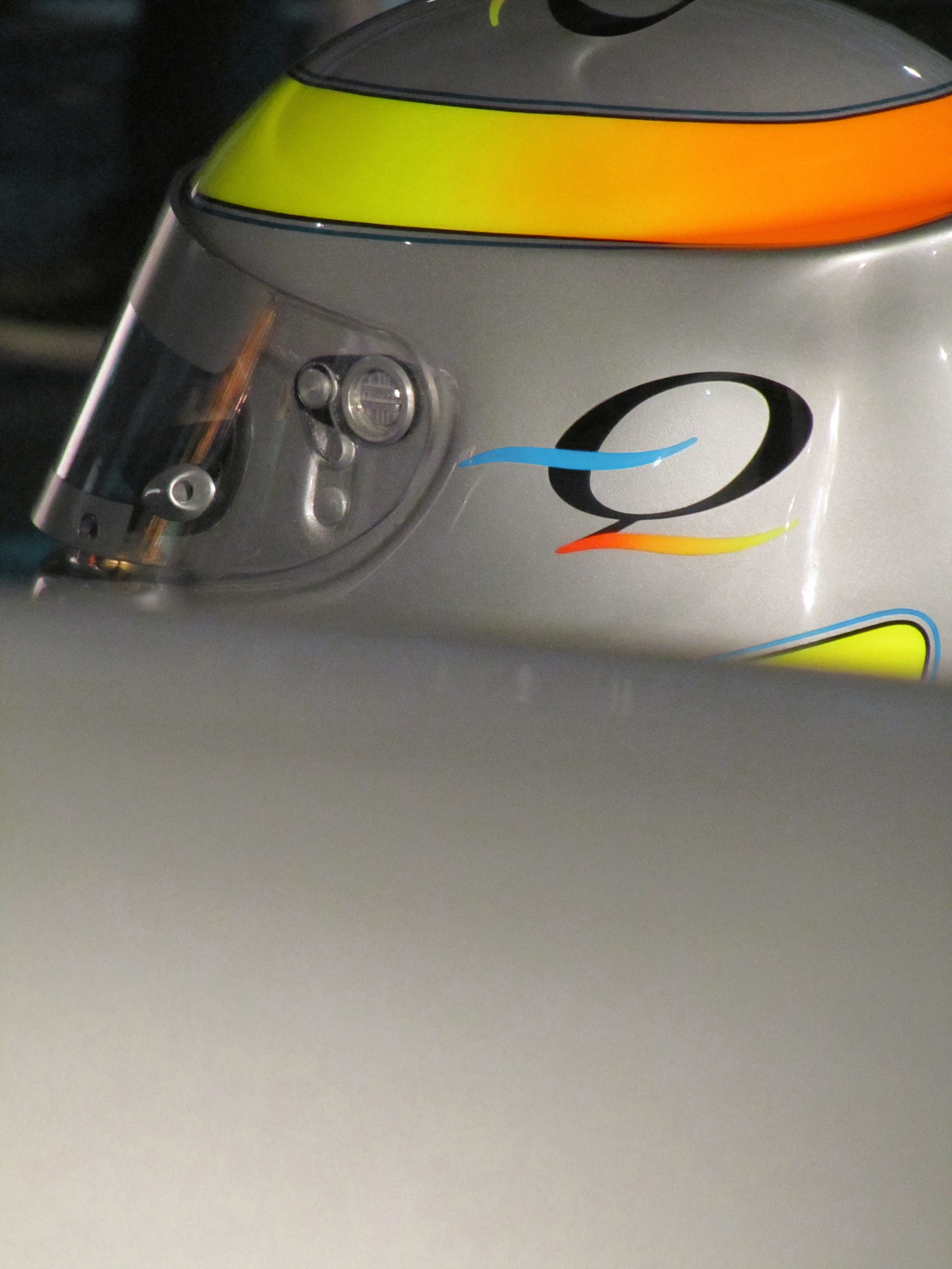
There is also an abbreviated form of the Quicksilver logo, which is displayed extensively on our team clothing, printed materials and so forth. Introduced at a later stage of the project and referred to simply as "The Q ", it is an elegant distillation of the key elements of the full-format logo, and – in common with it – has both black and silver versions, so that it can be clearly set upon any background colour.
"The Q " is prominently displayed on Nigel's crash-helmet, and the motif will also appear on the boat when its construction is completed.
Wherever the Quicksilver project presents itself to the world, in whatever situation, there is always strong consistency in its visual style. While for obvious reasons silver is the colour most naturally associated with us, it is an imaginative palette of colours that forms the total look. Our 'colourway' ...
Black lends drama and definition, multiple shades of orange and yellow add vibrancy. And pale blue – evocative of water and the sky in their happiest mood – contrasts pleasingly with all of those colours, completing the picture.
Great credit is due to graphic designer Richard Ainge, who for the past years has played a huge role in shaping the powerful Quicksilver identity. Creativity and technical skill are blended in equal measure, and only by everlasting effort is the required effect achieved.
Aesthetically from the outset, the goal was clear. Everything we do must have artistic merit.

Images this page © QWSR Ltd.

